
CASE 02 · PRUDENTIAL · PRU.COM
Clearer paths through life's biggest money decisions.
I designed and tested Pru.com journeys with real customers, so people facing high-stakes financial choices could understand their options and pick a next step.

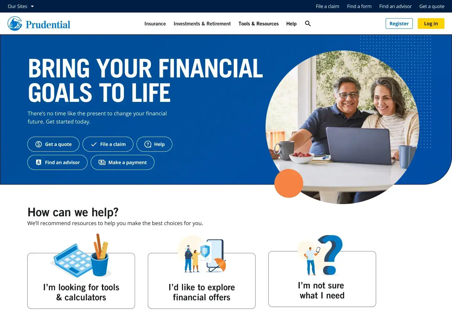
01 · THE PROBLEM
Money decisions are hard enough. The website shouldn't make them harder.
Prudential's customers come to Pru.com when they're facing big financial choices about retirement, insurance and investing. Many of them aren't sure what they need yet.
The goal was to make the site easier to understand, easier to move through and more helpful at the moments that matter. That meant balancing business goals, customer expectations, accessibility, brand consistency, technical limits and regulation, and looking at the whole journey: where people came from, what they were trying to do and what got in their way.
The opportunity was to take friction out of the journey so people could see their options and choose a next step with confidence.
02 · MY ROLE
Where did I sit?
Senior designer on Pru.com, from research to final screens.
I worked on UX improvements across Prudential's digital ecosystem, covering research, journey analysis, prototyping, usability testing and high-fidelity design.
Day to day I partnered with product managers, developers, content strategists, Journey Management, compliance and the design system team. My research readouts became the shared reference for why a design looked the way it did.
03 · HOW I WORKED THROUGH IT
A loop, run again and again.
Research set the direction, design made it real and testing sharpened it. Then we went around again.
STEP A
Understand
I pulled together what we already knew from user research, customer panels, usability tests, analytics and stakeholder conversations to find where people felt unsure or stuck.
STEP B
Explore
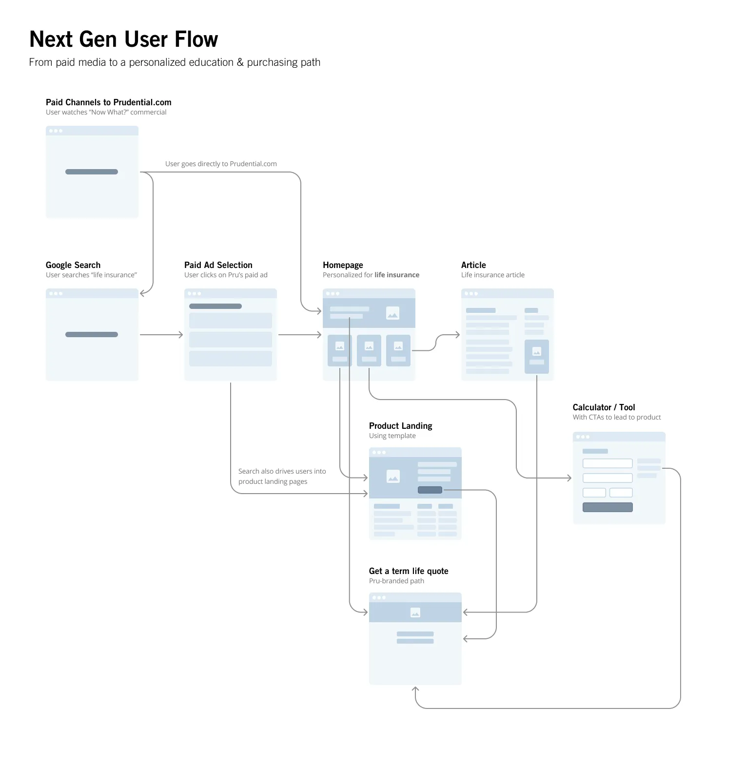
Insights became flows, wireframes and prototypes, so the team had something concrete to react to before any expensive build decisions.
STEP C
Validate
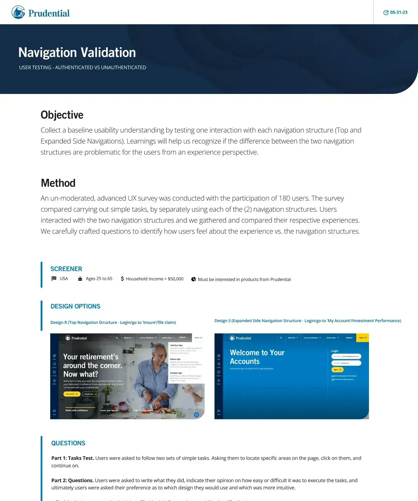
I ran moderated and unmoderated usability tests, analyzed the results and turned them into clear recommendations that kept teams aligned.
STEP D
Refine
The strongest directions became responsive, high-fidelity designs, refined with product, development, content, Journey Management and compliance.
04 · WHAT RESEARCH TOLD US
Good design decisions start with better questions.
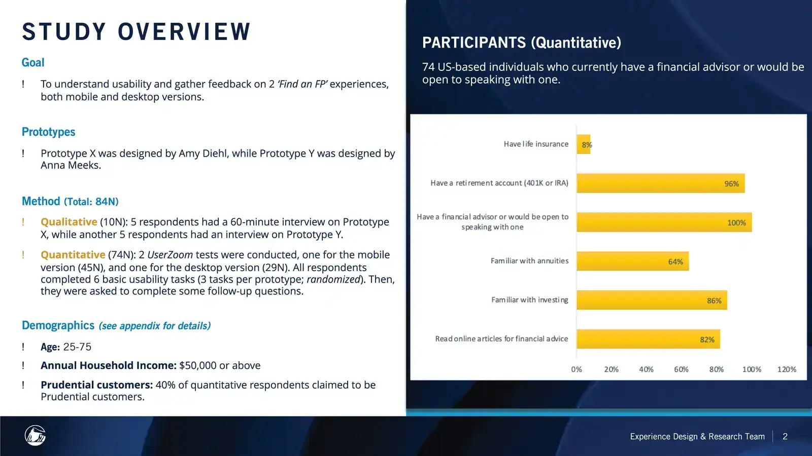
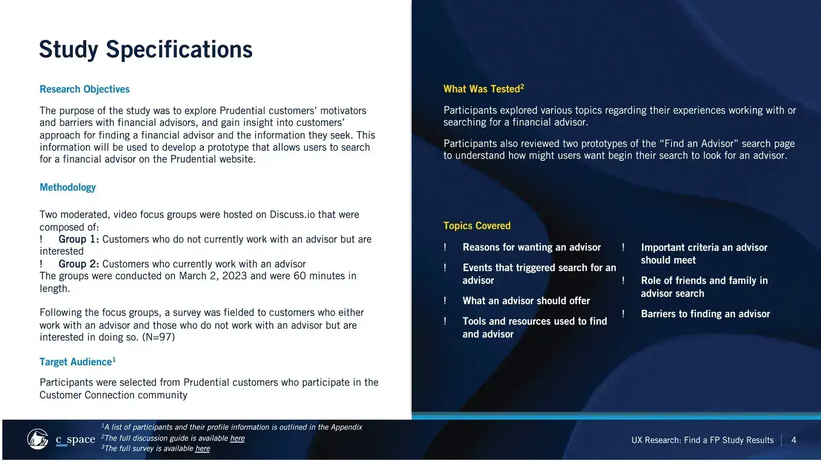
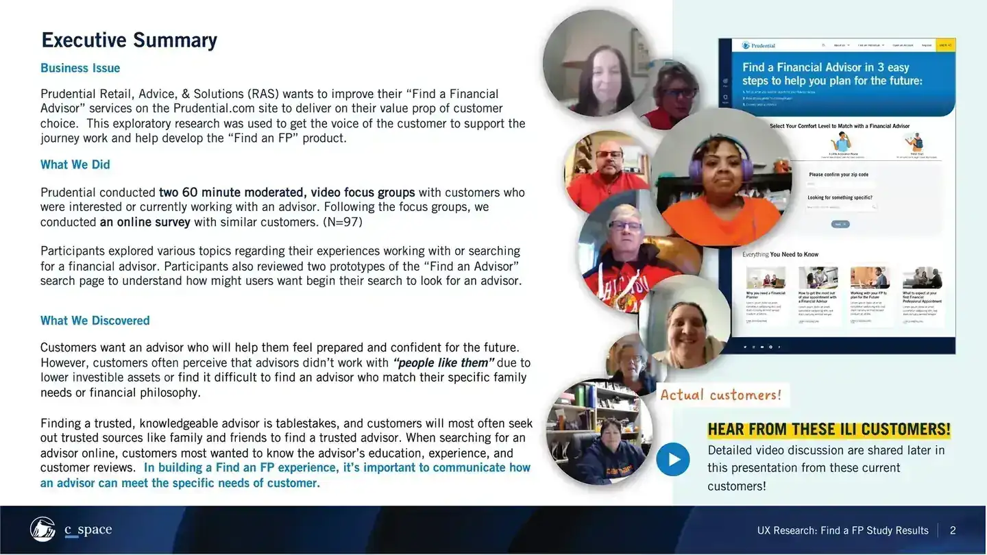
Research ran through the whole project. Customer panels, usability tests, stakeholder input and behavioral data each showed a different side of the problem, and together they surfaced patterns you couldn't see from the interface alone.
Readouts connected UX to the rest of the business. They explained what the problem was, why it mattered and where design could help most, which gave Journey Management, content, compliance and leadership something solid to act on.
Every readout ended with a clear answer to the same question: what should we design next, and why?
05 · STRUCTURE FIRST, POLISH SECOND
Hierarchy and flow came before polished screens.
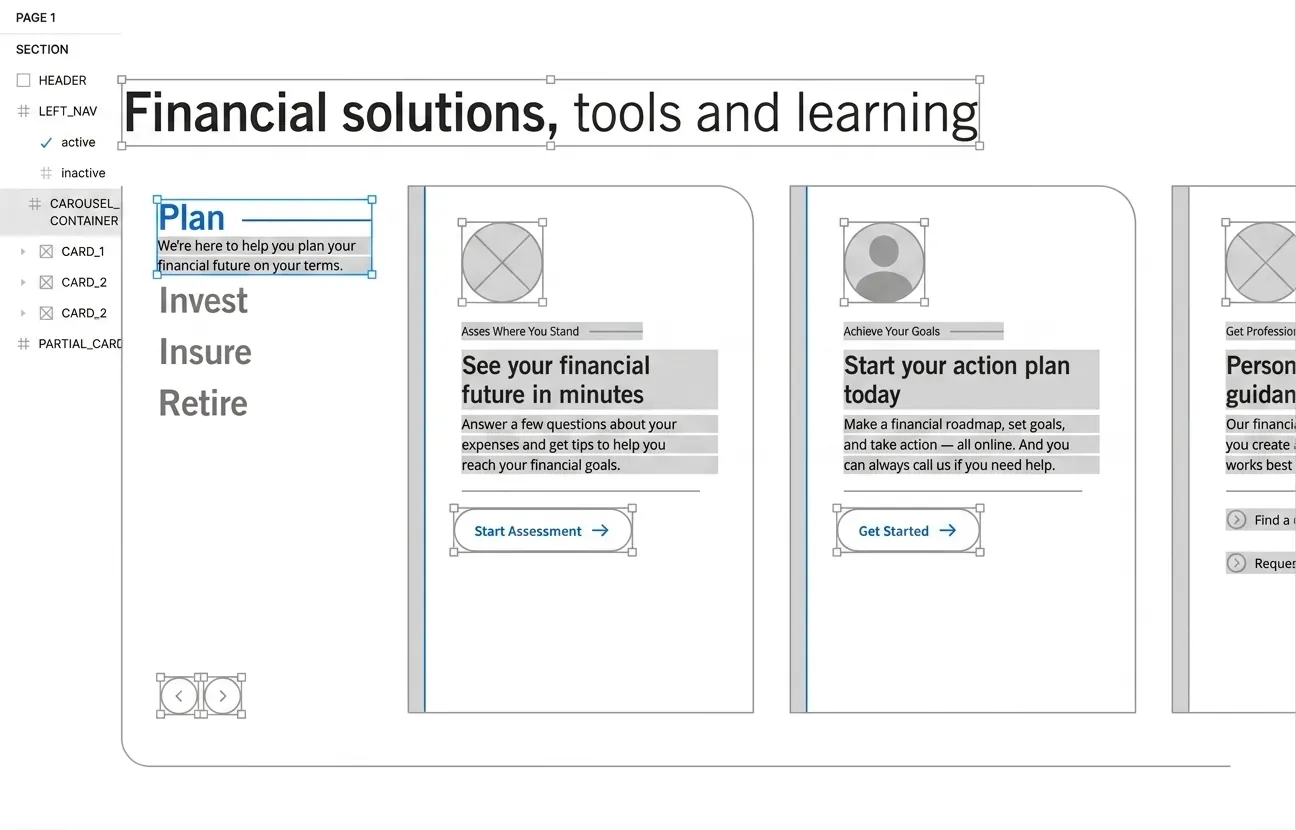
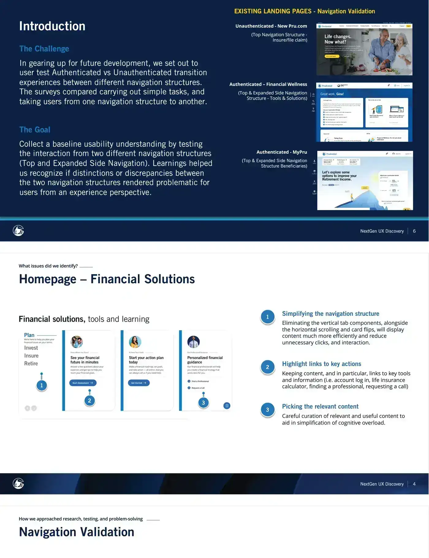
I turned the findings into flows, wireframes and interaction concepts, exploring desktop and mobile together. Early rounds were about hierarchy, flow, how content related and which interaction patterns made sense. Four needs shaped every decision.
- 01
Understand the customer
- 02
Clarify the experience
- 03
Connect business and user goals
- 04
Validate before committing
06 · THE PRODUCT
Every screen had to lead to the next decision.
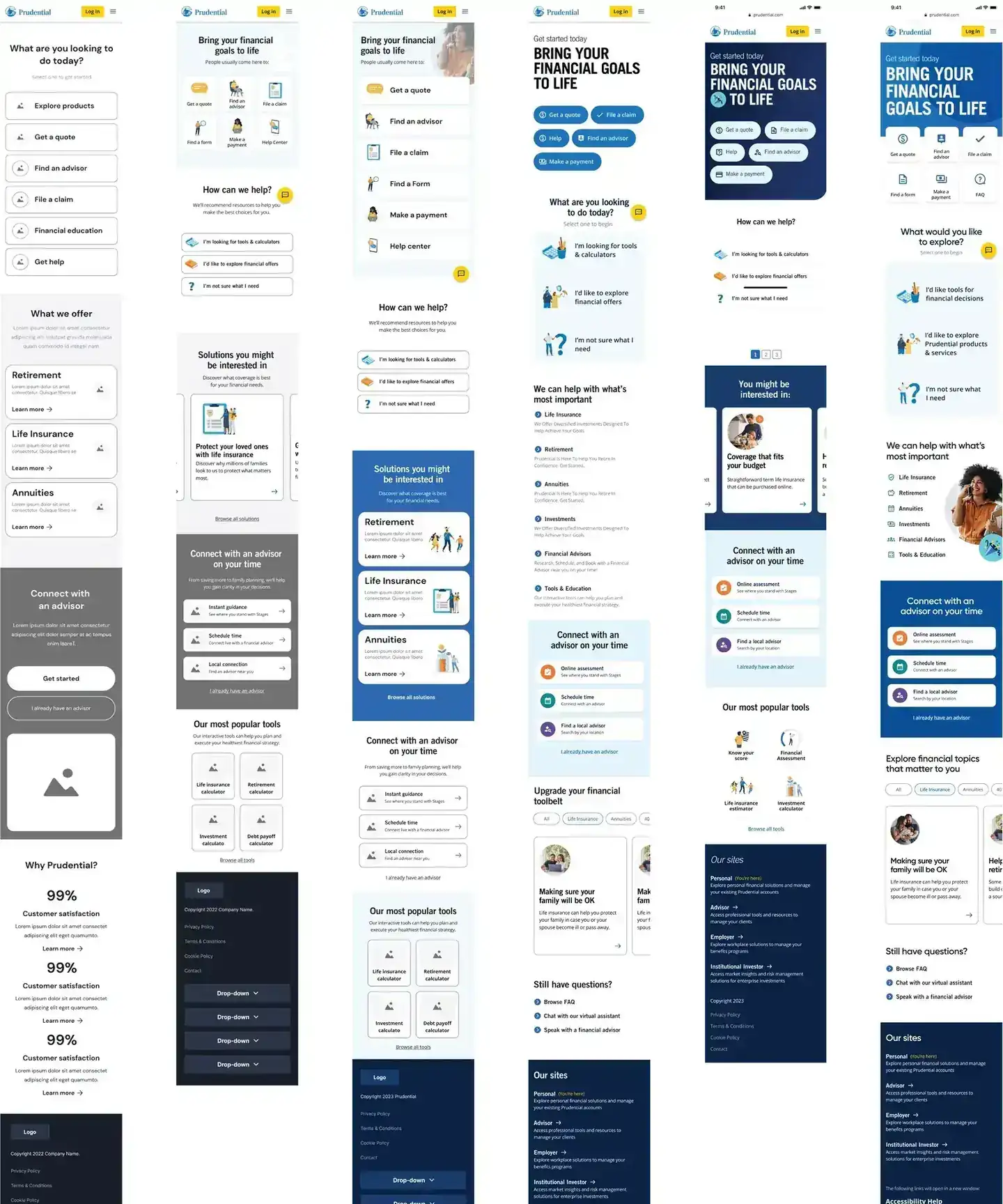
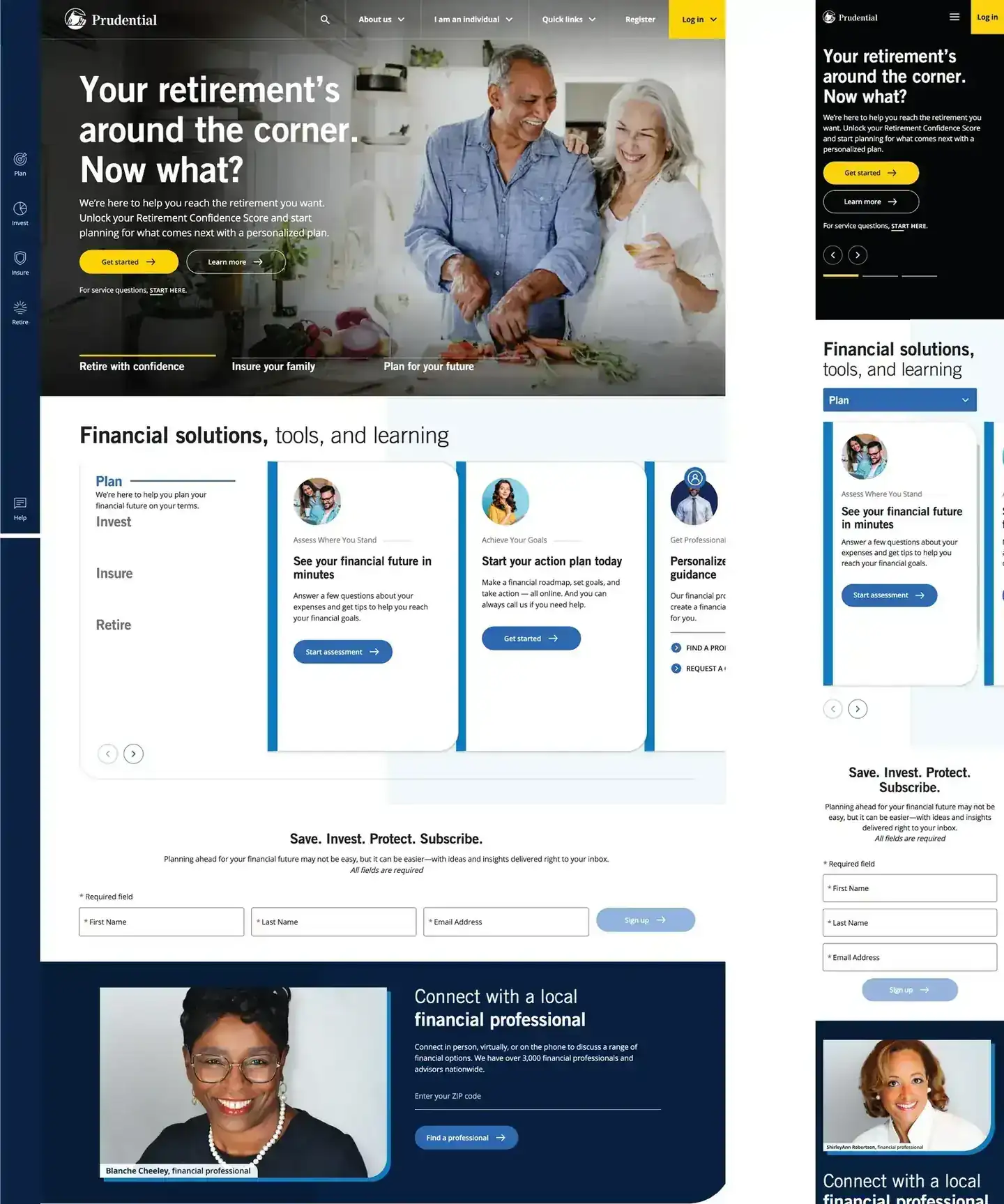
Once the direction was set, I built out a high-fidelity flow. Stakeholder and Journey Management priorities shaped the structure, while research and testing refined the individual interactions.
The details covered information hierarchy, interaction patterns, responsive behavior, accessibility, visual consistency and design system components. Polish alone wasn't enough. Each screen had to carry people from one decision to the next.
07 · RESULTS
Clearer journeys, measured with real customers.
The work combined research, strategy, interaction and visual design, testing and accessibility, and balanced what customers expected with what the business needed in a regulated enterprise setting.
10%
higher page engagement on Pru.com
6%
lower lead loss
Shared
Research readouts used by Journey Management, content, compliance and leadership.
08 · WHAT I TOOK FROM IT
Good UX makes the right things clearer and easier to act on.
My job was to connect customer insight with practical design: research the problem, define the opportunity, explore and validate solutions, then work with the team to ship them. Adding more rarely helped. Making the next step obvious almost always did.