
CASE 01 · JOHNSON & JOHNSON · CORPORATE WEB
Making a global health ecosystem easier to navigate.
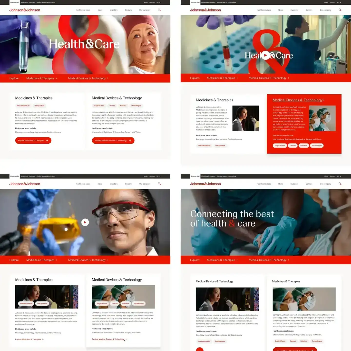
I helped improve key journeys across Johnson & Johnson's corporate web ecosystem, using research, behavioral data and testing to decide what to change and how.
01 · THE PROBLEM
One company, many audiences, and a site that never stops changing.
Johnson & Johnson's digital presence serves a lot of different people, with a wide spread of content, products and business needs behind it. Every team has something it needs the site to do.
The hard part was keeping each experience clear and connected while the organization behind it kept evolving. New pages and new requests arrive all the time, and each one can pull the ecosystem a little further apart.
The work had to fix the customer problem in front of us and leave the system in better shape for the next one.
02 · MY ROLE
Where did I sit?
Senior Product Designer, from first research to final UI.
I was a Senior Product Designer on the end-to-end design of the corporate web ecosystem. I covered research, strategy, interaction design, prototyping, testing and high-fidelity UI, working closely with the Product, Brand, Development and Design System teams.
My projects included onboarding, content discovery, responsive web experiences and reusable interface patterns. I used Figma AI and UX Pilot to speed up early wireframes and prototypes, which left more time for the decisions that needed a person.
03 · HOW I WORKED THROUGH IT
Start with evidence. Explore on purpose. Validate what matters.
Decisions came from evidence, with enough rigor to hold up at the scale of a global company.
STEP A
Understand
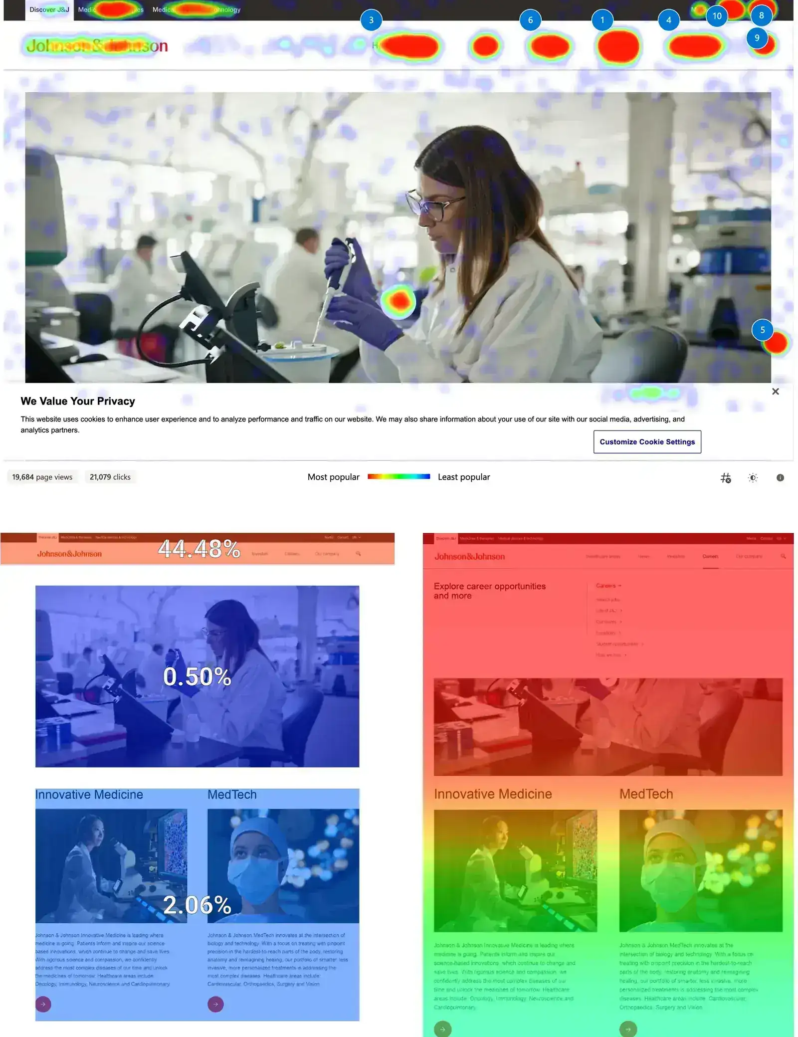
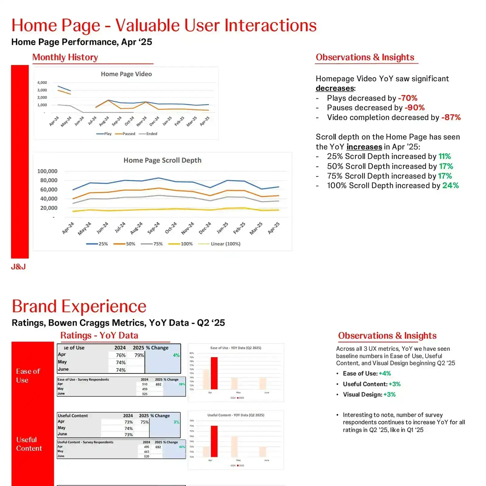
User research showed needs and pain points. Behavioral data, heatmaps, click rates and CTR tracking showed where engagement dropped and where design could make the biggest difference.
STEP B
Explore
Insights became flows, wireframes, prototypes and interface concepts. I explored several directions and used AI tools to cut repetitive production work. The tools helped. The thinking stayed mine.
STEP C
Validate
Testing, experiments and stakeholder reviews checked each decision. Cross-functional reviews caught technical, content, brand and system issues early, and the direction changed when the evidence said so.
STEP D
Refine
The strongest ideas became responsive, high-fidelity experiences. I worked with partners to fit them into existing patterns and flagged where new components were needed.
04 · WHAT RESEARCH TOLD US
Design decisions get stronger when behavior is part of the conversation.
Research ran alongside the design work the whole time. User needs, behavioral data, test results and business priorities kept shaping the direction as we went.
Each source did a different job. Interviews gave context, behavioral data showed patterns at scale, and metrics measured a change against what people really did. Together they made prioritizing a lot easier.
Knowing what people did was useful. Knowing why they did it is what changed our priorities.
05 · STRUCTURE FIRST, POLISH SECOND
Hierarchy and flow came before any visual polish.
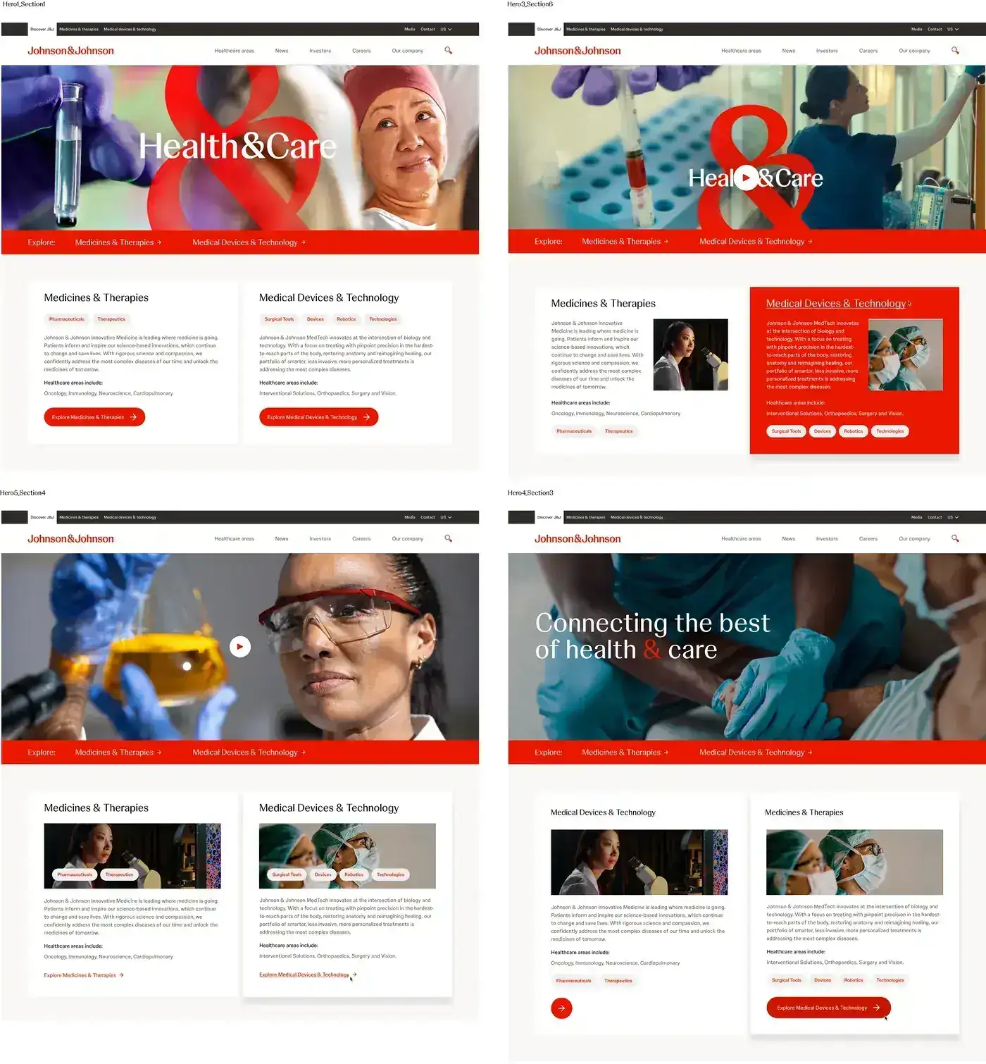
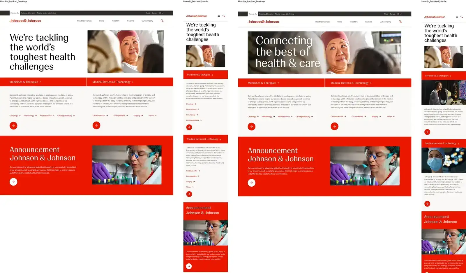
Once we knew where the opportunity was, I turned the insights into user flows and prototypes. Early rounds focused on structure, hierarchy, interaction and how pieces of content related to each other. Every concept had to answer the same questions.
- 01
What does the user need to understand?
- 02
What should happen next?
- 03
Where is the friction?
- 04
How does it stay adaptable?
06 · THE PRODUCT
Built for today, ready for the next request.
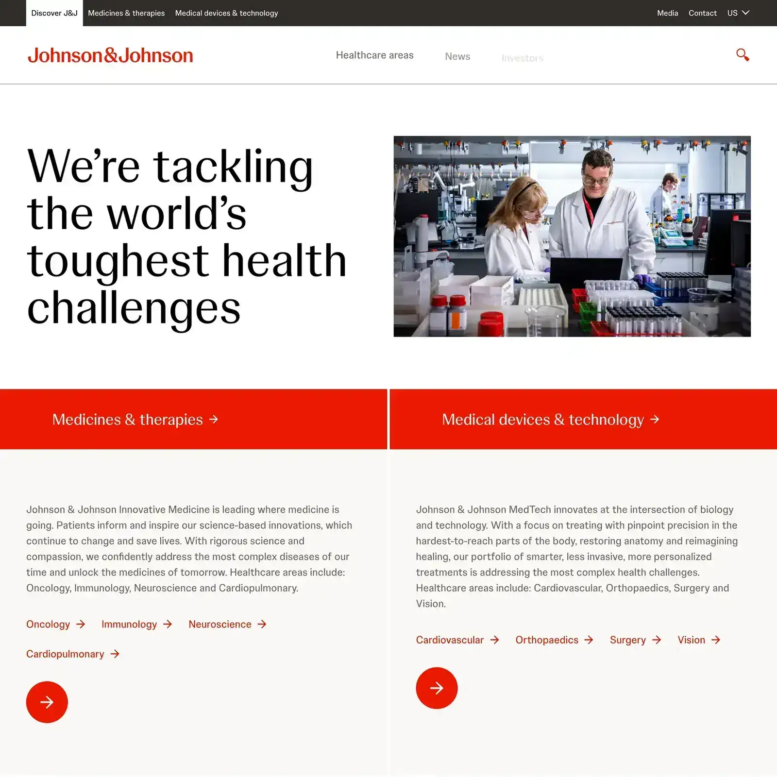
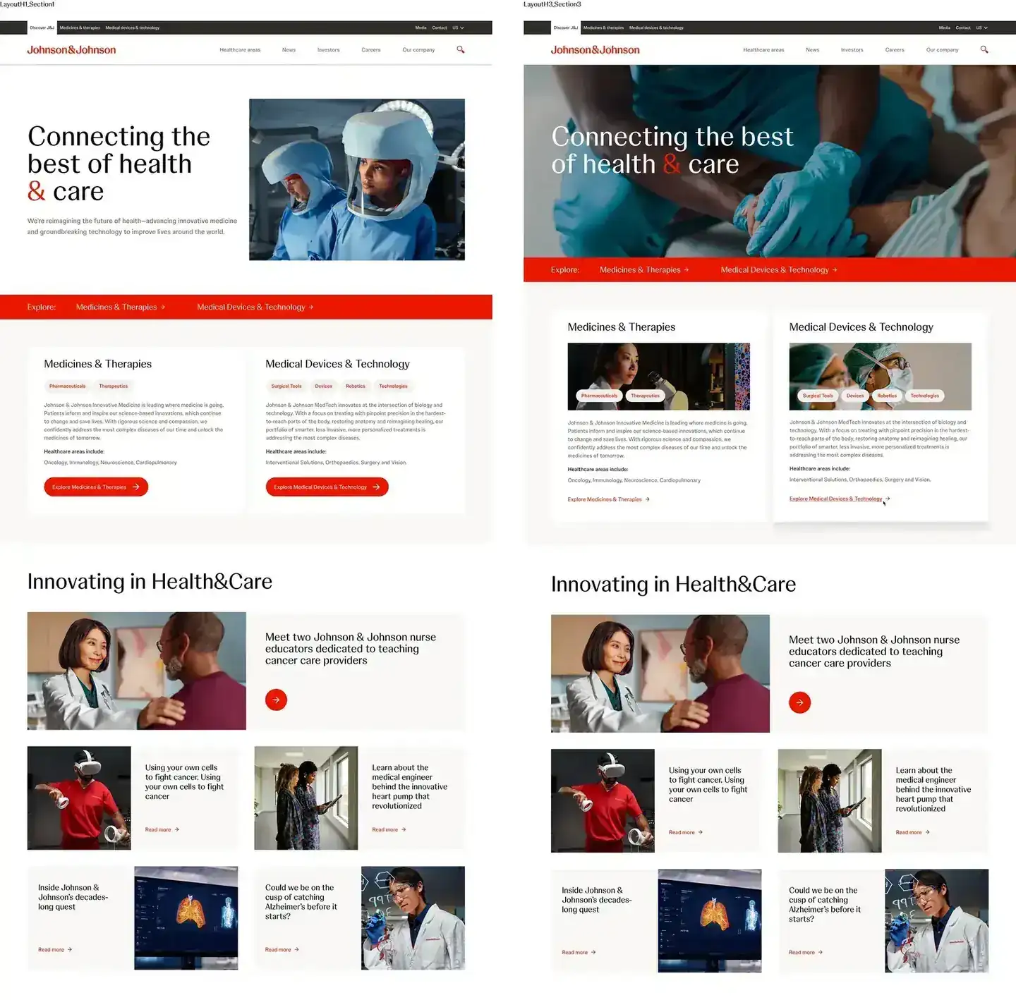
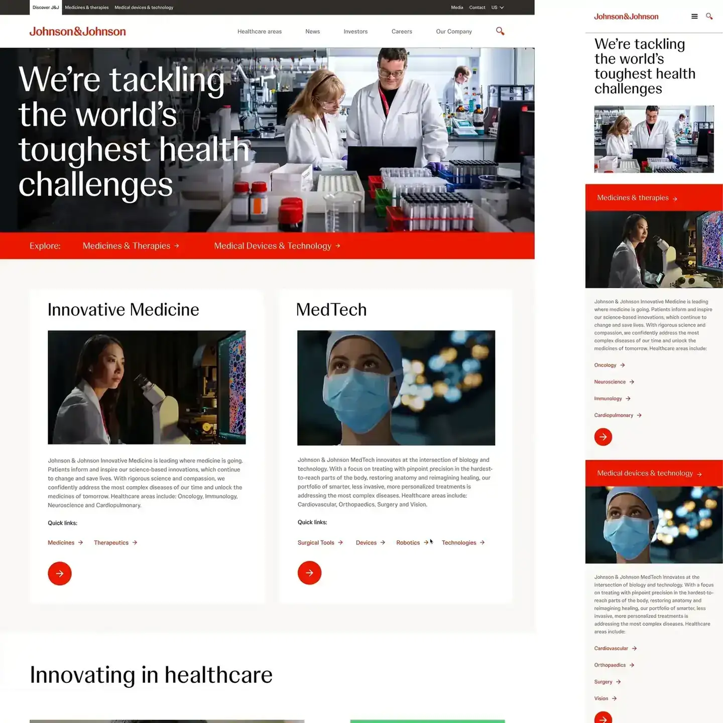
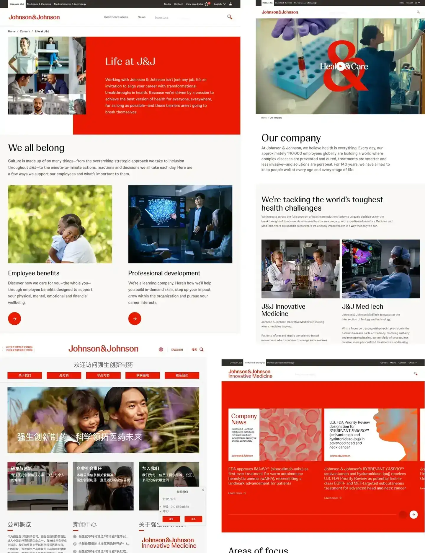
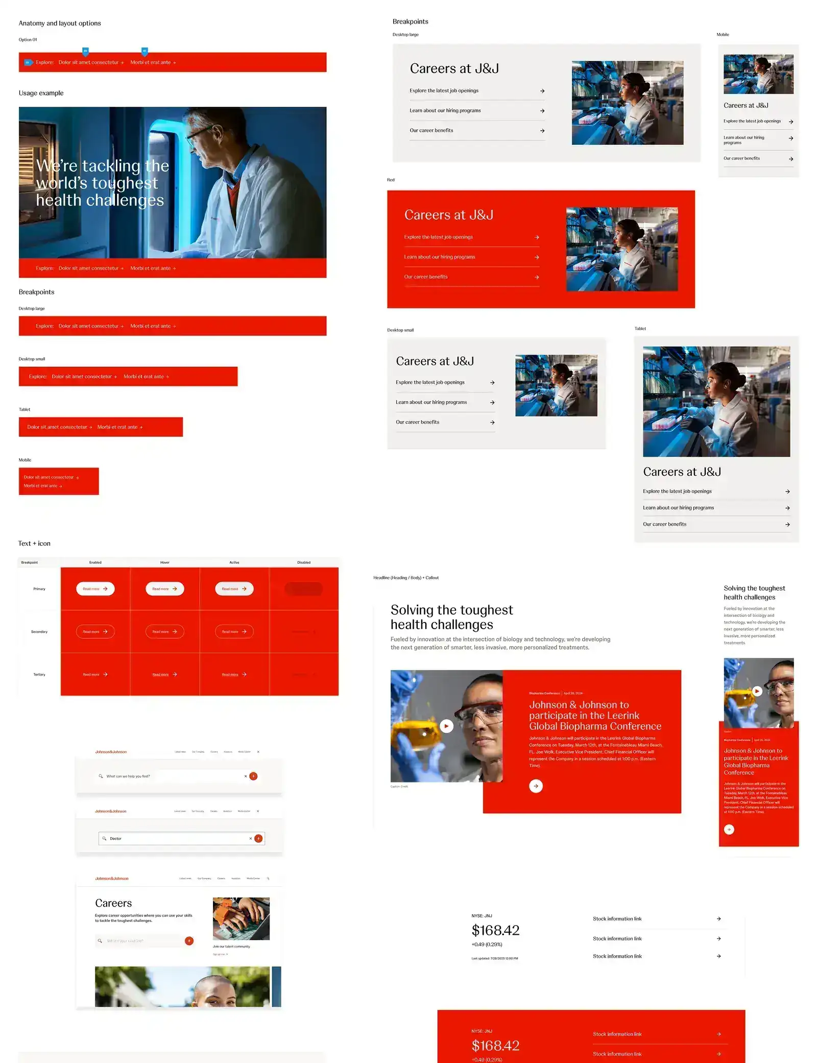
I took the chosen direction to responsive, high-fidelity designs aimed at an MVP. Each solution was checked against the wider ecosystem: how it behaves across devices, how it fits the brand and existing patterns, and whether parts of it could be reused.
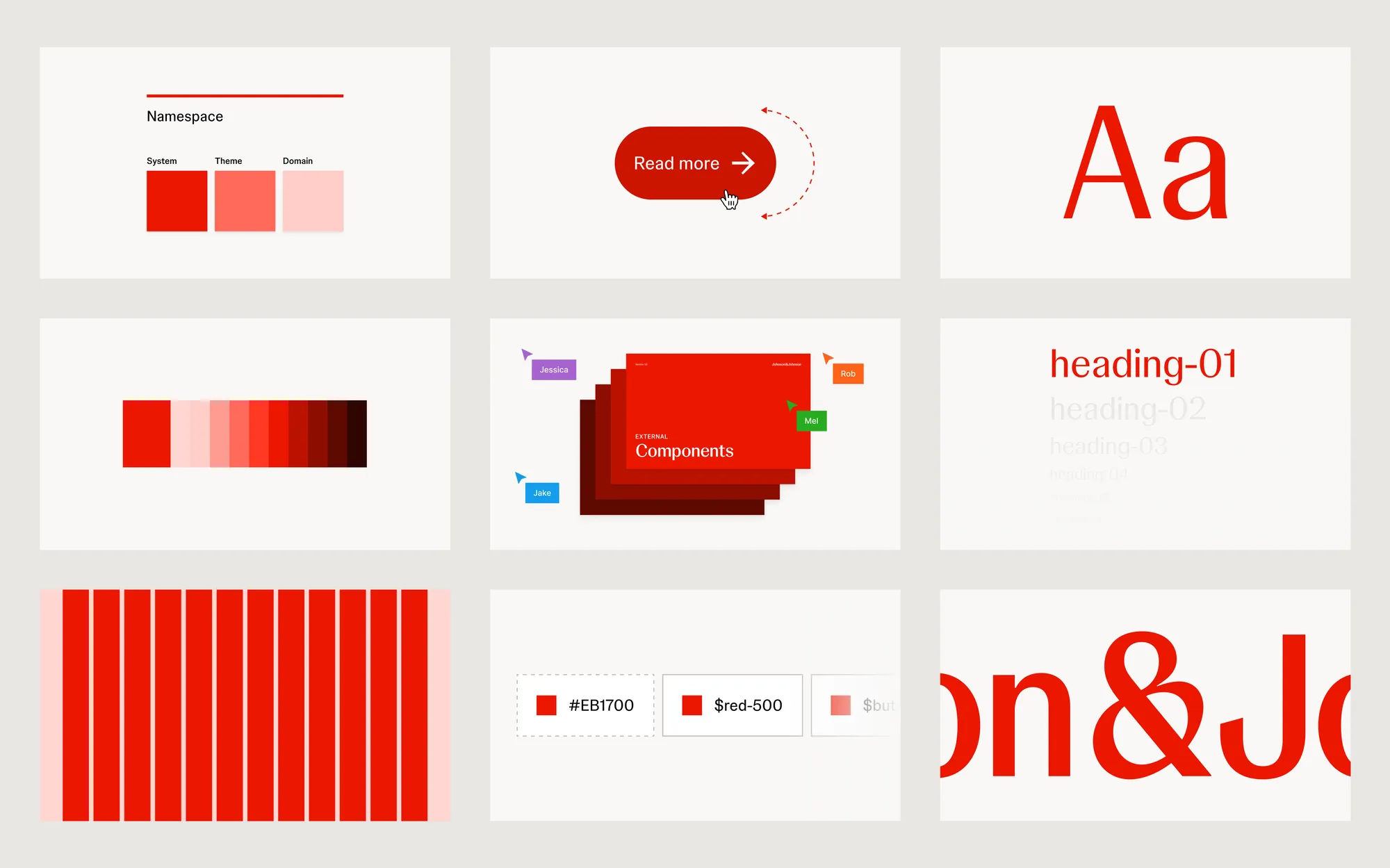
When an existing pattern fell short, I proposed new components and modules that extended the system, so we weren't stacking up one-off fixes.
07 · RESULTS
Better journeys, a stronger system, and a faster path from insight to design.
The work fed into the ongoing development of a large corporate ecosystem. It brought research, behavioral data, experimentation, responsive UI and AI-assisted workflows together into one way of working, and gave the team an evidence-based approach that respects enterprise, brand and system constraints.
Evidence first
Changes were prioritized by real behavior and test results instead of opinion.
Reusable
New components and modules extended the design system for future teams.
Faster
AI-assisted wireframing and prototyping shortened the trip from insight to design.
08 · WHAT I TOOK FROM IT
Design for the experience in front of you and the ecosystem behind it.
Solving the customer problem in front of you only goes so far in a company this size. The work also has to make the next project easier. Using evidence to find the opportunity, validating with real behavior and working across disciplines is how an experience keeps up with the organization behind it.